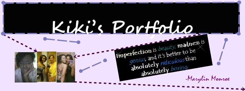
My Projects
Below are a few of the projects I did in Electronic publications blah blah blah over throughout the semester. Please enjoy
Photoshop
Below are a few projects I did using photoshop. ENJOY!!!

This picture shows how to create a vignette image. I used the Gemini twins Castor and Pollux because I am a Gemini and I love the artwork that displays them.

This picture is a banner I created pertaining to basketball. besides the Gemini picture this one is my 2nd favorite.

This picture displays a coupon. It was one of the harder photoshop tutorials I did.
InDesign

I created this design to display a sneak peak of Laguna Beach at night. The employee stated that she wanted a basic four color-scheme. I looked at the website and noticed that it used a lot of green, black, cream and reads. I chose not to because my focus was the festival at night and I didn't feel that it would fit in my color scheme. Instead I used a mix of black, cream, red and added yellow, mixing them in a way that would catch a readers eye, especially in a magazine such as WestWay AAA. (I also noticed that this particular magazine uses a lot of blues and greens and I felt my color scheme would contrast and pop out oin the magazine.

This business card is apart of a three part project I had to complete for an architectural company which also included a letter head and a customized envelope. Although small this project was one of the more difficult one's to complete. It took a lot of effort to get the ruler and triangle just right. However it was very fun to create and one of my favorite InDesign projects.

I chose the G-tree design because the company's first name is Green Acres Landscaping. The company description says that it's a local company, so playing off that I wanted a simple yet lasting design that would set this local company apart from main-stream landscaping companies. I made the G from a circle that had been subtracted from another circle. I gave it a flowy curved look using direct select. I also made the tree in a similar way using the same techniques only on the rectangles. Since this is a landscaping comapny I used the colors green, black, brown, and blue to reflect earth and sky, colors that landscapers are familiar with. I chose this design because as I previously stated I wanted to do something simple yet catchy.